


Minnesota’s new state flag should feature an eight-pointed North Star against a dark blue background shaped like the state, with a solid light blue field at the right, a special commission decided Tuesday as it picked a replacement for an older design that many Native Americans considered offensive.
The State Emblems Redesign Commission chose the final version on an 11-1 vote after finalizing a new state seal that depicts a loon, the state bird. Unless the Legislature rejects them, the new flag and seal will automatically become official April 1, 2024, when Minnesota observes Statehood Day.
The star echoes Minnesota’s state motto of “Star of the North.” The commission’s chairman, Luis Fitch, said that to him, the light blue represents the Mississippi River, “the most important river in the United States,” pointing to the North Star. But he acknowledged it could mean other things to other people. Symmetry and simplicity won out over other versions, including ones that included a green stripe for the state’s agricultural heritage.
Too bad they didn’t go with the Polaris Tri-color. I agree with Grey that it was the best of the color variations.
I liked this choice. The tri-color seemed a little busy to me.
I agree. I do like the tri color and would have been happy with it, but there’s a quote from whom I cannot remember that essentially is “flag design is finding the perfect flag and then dialing it down a notch”. And to that end, I think it succeeds wonderfully.
It’s modern but classic. Detailed but not busy. Inclusive but not all-encompassing. It’s pretty amazing.
I am glad they changed the star design; I think the new one is much better.
My only gripe with the alterations of the submitted design is the star shape change.
I loved the big points in the cardinal directions with smaller points in between. I dislike this eight-pointed star.
They were both good, but I think they made the more-refined “high-brow” decision by going with fewer colors.
I’m actually jealous of this flag. Only downside is it’s kind of hard to see against the blue sky, lol.
I think the 2 tones of blue make it look more like a basic corporate design than “high-brow”
Do you like places with stickers everywhere?
Not particularly, but I’m also not bothered by the presence of more than one color.
I would have sworn my eternal allegiance to the Polaris Tri-Color. This one is nice, especially for a state flag, but not inspiring.
Tricolor was better. 120%.
I recently finished watching that video and NGL the tricolor with less toned colors looked pretty beautiful to me.
I like that they went with the simplified “K” shape for Minnesota (the reverse triangle is really clever visually) but I did also like the more colorful version better. Just a little too plain now for me.
I don’t even know what Minnesota’s flag looked like.
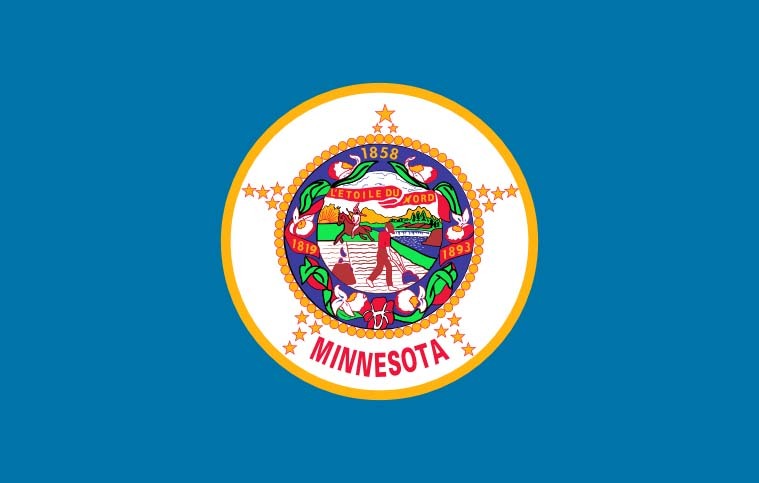
Uh, no one is going to miss that.
Don’t worry, Republican legislators are already in frothing rage about the change. I’m sure it has nothing to do with them wanting to keep the problematic imagery in the current one of native Americans being driven off their land. /s
Also they’re spreading some conspiracy theory the new flag is supposed to look like the flag of Somalia or something and that this is a prelude to Sharia law being imposed. I wish I was joking. Yeah, because it has blue colors and a star in it, it must be an homage to Somalia, couldn’t have anything to do with being the “land of 10,000 lakes” and “the north star state.” Or even the old flag, which get this, is blue with a big star in it.
I also liked the version with the stripes better, but this is very nice too, and anything is better than the atrocious current one. The new seal with the loon is very nice too.
Other states that just lazily slapped their seals on to a blue background take note and get to fixing them up please.
New seal:

Libtard snowflakes don’t even know what a seal looks like. It sure ain’t looks like a bird, I tell ya
But loons are half bird/half seal with bitchin’ red eyes.
And these morons gave it white eyes. Will the insanity never cease?
I have fantastic news for you, looks like the one I posted was revised slightly before approval. It’s got the red eye now!
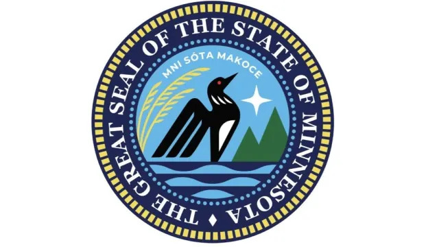
I was 100% joking, but that’s hilarious that they changed it.
I agree it’s much better this way. Laser loon lives on.
This looks so metal! It’s perfect!
They changed the words too! Idk what they mean though, the old words or the new words
Old words are the state motto which is in French, star of the north. New words are the Dakota name for the Minnesota river, from which the state derives its name. Some controversy over which barely visible words to go with. Both seem fine to me, I just want that red loon eye.
Other states that just lazily slapped their seals on to a blue background take note and get to fixing them up please.
As a Virginian, I take slight offfense at this! ^but ^yeah ^our ^flag ^is ^just ^the ^state ^seal ^^on ^^a ^^blue ^^background
Loonie flag?
Why are the using the same bird as the Canadian money?
Is Minnesota signaling they intend to join Canada?
I wish! It’s the state bird though. It’s been the unofficial seal and symbol for some time already. And with all the lakes there are tons of loons.
No that was the tricolor variation that preceded this final design, and it actually did look like a Somalia flag. I think this one will be pretty well liked by pretty much everyone. The only people who won’t like it will instinctively not like it because of the taint of wokeness as a motive to change it. Whatever. But at the end of the day, it was a trash flag and everyone will ultimately agree that it’s better now.
Ironically the changes brought it closer to the actual flag of Somalia which is just light blue with a star on it (the three stripes were from some provincial flag, obviously cherry picked out of the many different flags with green blue and white in them to try and rile people up). I don’t care though I think it was a stupid argument anyways. I liked the look of the stripes better, but I like this one too. Just was very tired at seeing the very predictable rhetoric from the right in response to a positive change correcting an ugly poorly designed flag. Glad there’s a new one now.
Racism aside, it’s like an ugly Christmas sweater in flag form.
I love it when someone can verbalize my feelings perfectly.
I cant make out the racism. Is that supposed to be a slave? It looks like a taco bell employee the way hes dressed
That is a terrible flag even without the racism. A good flag should be clearly identifiable as an emoji or at least a stamp.
CPG Grey will be so excited.
We need another “breaking flag news” update asap.
This is the only reason I clicked on this post as I reckonized this flag from his video.
It’s worse than the original design with the white/green/blue tri-colour on the right.
But still a big improvement.
Removed by mod
I like how easy on the eyes it is.
It’s actually pleasant to look at while not demanding your attention.
Solid flag.
Oh cgp grey’s favorite won
I was gonna say I that looks like a flag cgp would love. Glad it’s the one he approved of.
It’s still not the good colors though
Cool. Now he should bring back HI instead of leaving its Patreon up for three years. I don’t care that it only collected money when episodes released, the optics of it matter.
HI?
Hello Internet
Relevant: CGP Grey Grades State Flags!
He did one about this new flag too! https://youtu.be/lFwwo0W5Ugg
Huggbees also does some flag reviews.
He also just recently published a follow up on this flag specifically.
The new flag is badass!
Big day for !vexillology@lemmy.world
I just looked it up out of curiosity, and Minnesota’s old flag is boring and generic AF. It was a member of the “state seal on blue” club.
We’ll be trying to get our hands on a nice flag with the original design#1953 on it to fly outside our house. This one is fine I guess, but it stings with what could have been.
That looks really nice.
What the hell happened to the star‽ They took away its twinkley starriness. Now it just looks like a blurry circle
64 bit ==> 16 bit
Cool flag. I like the solid light blue over the stripes that were an option, K.I.S.S…
Feel like with that simplified they could have done something with color a little more interesting than the dark blue to really emphasize the shape of that dark blue region but if you can’t give this a 10/10 your standards are too high.
I liked the tri-color design, but this one is good too, like you said simplicity is best. The dark blue in the K shape is shaped like the state, so the solid color fits.
I like it fine, and I bet you could incorporate those design elements into a lot of cool merch, which is a nice rule-of-thumb for useful flags.
This is a great choice. That flag is probably now the best one in the Union.
In my opinion Mew Mexico and Arizona are both better. I hope this encourages more states that are just “blue field with state seal” to make better flags. New York really needs help 😅
Colorado has a C on it!
I was just thinking that!
Yep. Here in Oregon everyone just flies the Cascadian flag
Except for the southern part of the state which is all about the State of Jefferson flag
Our flag should just be the back on both sides.
And it should be a platypus instead of a beaver.
I had not heard of the State of Jefferson before. Wow, just wow. I’m really surprised how old the proposal is.
Ohio’s is the only one not shaped like a rectangle, therefore it is the best.
Colorado’s is clearly better. Definitely the most recognizable.
Alaska is pretty good, and it’s designed by a 14 year old.


