
I remodelled my baby’s mobile for exactly this reason. Seemed stupid to have the animals face up when baby is underneath, so I turned them round and made them detachable so baby could pull them off and play with them too.
Just use a 3rd party a…h, crap.
The secret ingredient is enshittification.
It’s actually optimized for them. The goal is to get users to spend time and see ads etc. The UI is not made for us users.
Just like cellphones.
There are no ads in discord, there’s really no point to force the new UI on everyone.
Well: https://arstechnica.com/gadgets/2024/04/discord-starts-down-the-dangerous-road-of-ads-this-week/
Edit: it’s more loot box stuff… but it’s step one
Yet
The discord UI was great. And then they made it ugly and slow as fuck.
Honestly, I find it pretty decent. I only wish I could see timestamps per message on the new UI
Discord was a train wreck from the off
Not sure where the discord hate is coming from (besides the new mobile app). If you’re someone who has to use Teams for work, surely you’d kill to switch to Discord instead.
Let’s add google drive.
I hate their ui.
Can someone tell me how to force Google drive to show me folders instead of files on start? Why would I ever need to look at a mess of files? I spend time organizing them into folders a reason, no thanks Google I really wanted them haphazardly thrown in my face.
Is this the setting you’re talking about?
The worst thing they did with the UI which OneDrive also does, is take the universally understood concept of “Saving” and make it mean 5 different things within the same program.
I don’t know what the problem with Discord is. It isn’t that different than it was before and it’s actually easier to navigate now. Maybe it’s just because I hadn’t been using it much before the change?
They changed the mobile app, it used to be like the desktop app (standard desktop chat gui) but adapted for phones, now it’s different and kinda sucks (not because it’s different, but because it’s janky and buggy and can take 5-10 sec to load anything other than the channel you were in when you last closed it)
I’ve only ever used the mobile version.
It isn’t that different > that’s problem number one
It’s easier to navigate > the same way the first step towards a destination 10km away technically makes you closer to your destination
Spotify joins the chat
It was quite alright. Limited but ok. Then they started shuffling things around and made everything cluttered and cumbersome and ugly and by now it’s seems to be tradition with every update.
Completely unusable for me on PC. I really don’t get why I’ve to drag the fucking portion where my playlists and albums are so I can see them all in a bigger size.
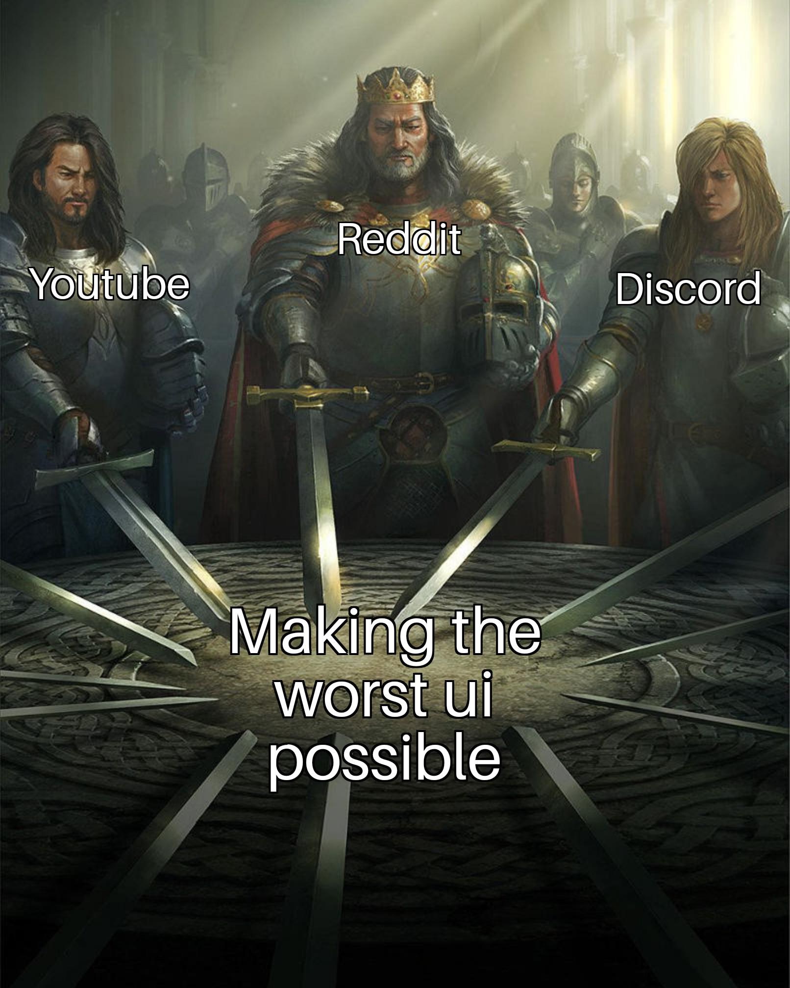
The one competition I can win against all big corporations
The competition in making the worst ui?
Yes
GIMP
How do you have these listed and not the myriad of FOSS products that are garbage to use.
Y’all remember mumble? Easy peasy compared to discord amirite?
GIMP looks a lot nicer than it did 20ish years ago, but it’s still really really bad.
I can somewhat forgive FOSS tools for having poor UI, but GIMP is one tool that really should have some love poured into the UI and how usable it is for power users.
GIMP does look better now, but I feel like its workflow is actively working against the user experience.
Y’all remember mumble? Easy peasy compared to discord amirite?
But Mumble is not a Discord alternative, it’s a TeamSpeak alternative.
If the aim is to drive users towards brainless engagement with arbitrary content, they’re great.
But for UX they’re dogwater.
What’s bad about discord?
It’s not good, but I guess it isn’t too bad.
But I imagine they’re referring to the new mobile UI, which is a mess.
Yeah, Mobile UI
I’ve always thought their desktop UI to be trash too. It would definitely surprise me if I could use any discord feature without a struggle
The app has gone absolutely down the shitter after they decided it should mirror other shitty apps instead of the desktop experience. Desktop I’d argue isn’t as much worsened, but there’s still annoying details like the omnipresent gift button.
The new UI on mobile app is awful. Less intuitive, slower and buggy. I don’t know how they did this, but sometimes it takes even a few seconds to switch between views (eg. from servers to DM)
The fact that it exists and that people use it for more than just video chats.
Trash UI
Discord always had the worst UI I’ve ever seen. Followed by Snapchat.
coming from slack I actually found discord rather intuitive, snapchat on the other hand…I never understood what kind of freek would want to take a selfie the first thing they open a social app
You forgot Spotify
Wait what are the big gripes with the Spotify UI? It works well for my purposes so genuinely curious
I’ve been using Spotify since it came out and I’m starting to feel it’s time to move on soon. My main gripe is that the UI is getting less user-focused and more interested in pushing content and shitty social media-like features. It’s getting bloated and annoying. Plus of course whatever major labels are pushing gets weighted in search results and recommendations. Just a few days ago I got a marketing pop-up (“what QUESTION would you like music to answer for you?!”) which feels like the last straw. I paid for premium, I know what I want to listen to, just get out of the way. And if you absolutely must have some shitty “reels/shorts”, give me the option to turn them off. (I see my kids wanting to listen to a song, getting distracted by some crappy flashing video, swiping around for a while, then exiting the app out of boredom. Luckily they have parents that can help them understand music from a different perspective than 20-second endorphin flashes.)
I guess I’ll just go to Bandcamp full time and piracy if I want to listen to something before I buy a physical copy.
I still dont understand why they had to make playlists/albums/artists/etc “filters” or hashtags or whatever you call them, and blend all the different types of items in a single page…


