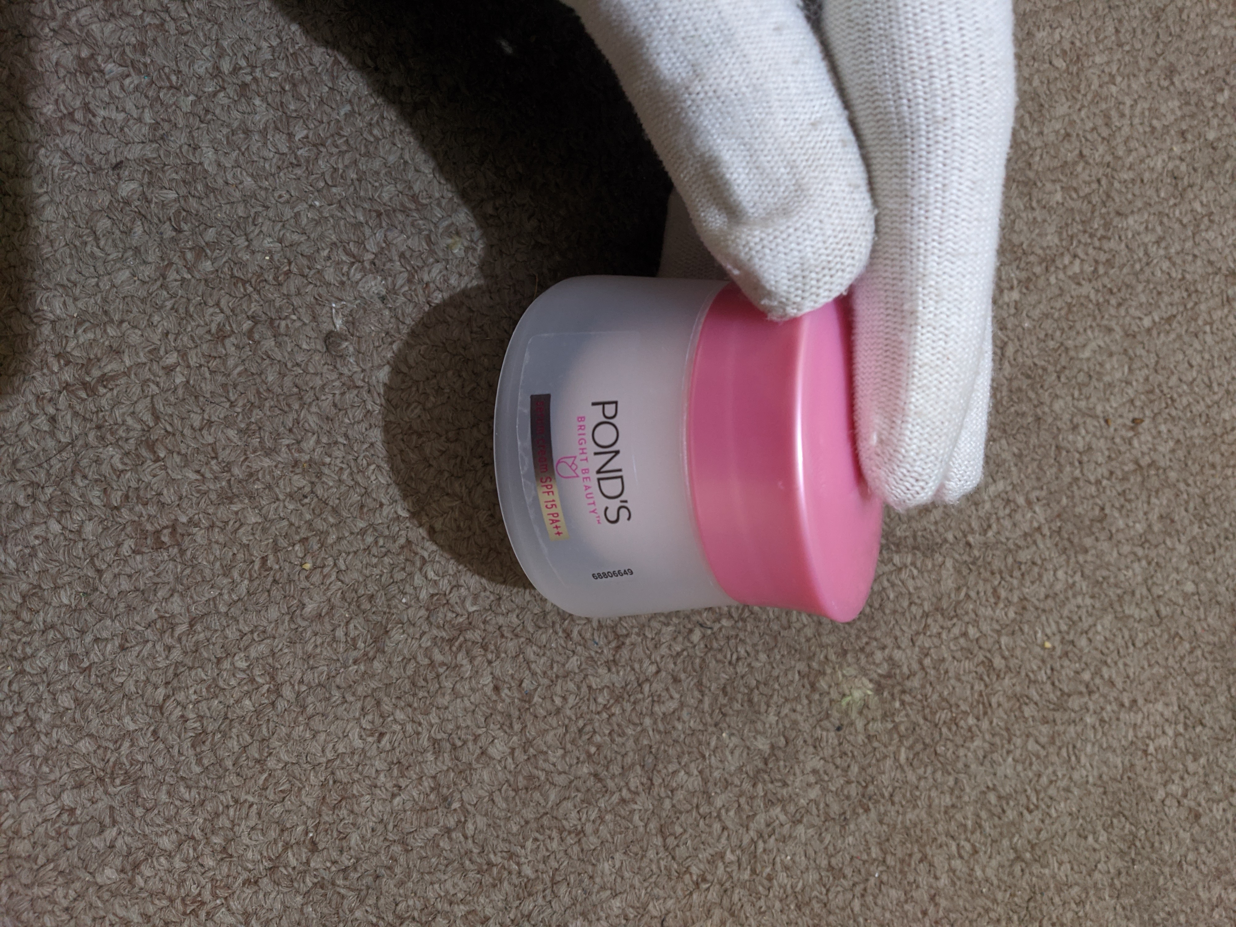
If this design really isn’t asshole design, then why are they still doing it like this? It’s pretty obviously supposed to look like it has more content than it does rn; and even if you do realize what’s going on, this makes it way harder to guess the amount of the contents. A number for gram amount is ok, but your brain really guesses by looking at the content, not the number.


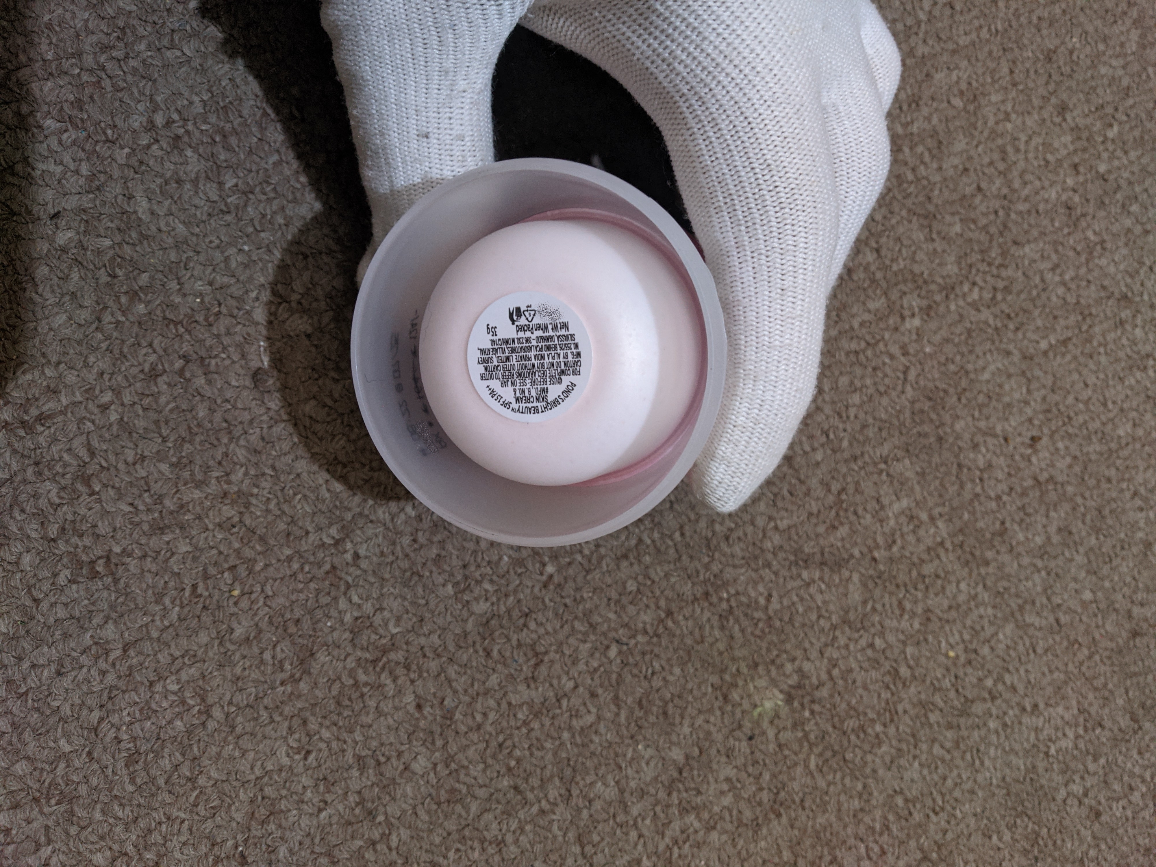
If this design really isn’t asshole design, then why are they still doing it like this? It’s pretty obviously supposed to look like it has more content than it does rn; and even if you do realize what’s going on, this makes it way harder to guess the amount of the contents. A number for gram amount is ok, but your brain really guesses by looking at the content, not the number.