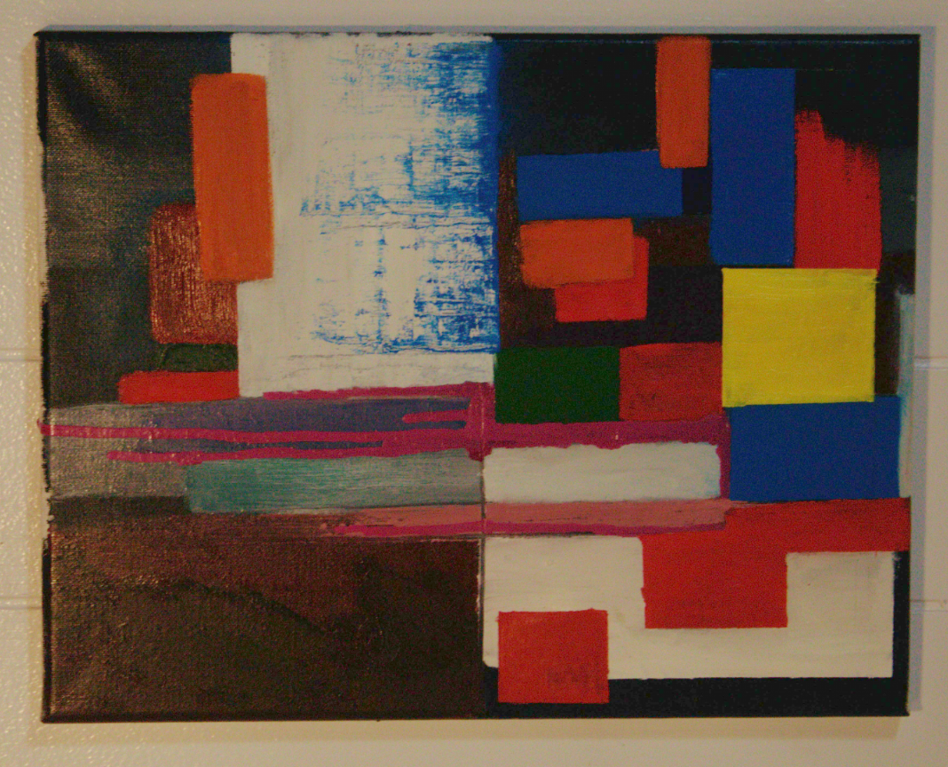
So I’m guessing you’re going for a color field painting, like Mark Rothko or Piet Mondrian style yeah? If so, great job! You’ve captured this style very well. In my personal opinion, the ‘weight’ of the top half of the painting is a bit heavy or busy versus the bottom half. I would suggest turning the painting sideways or upside down and seeing if you like it.
So maybe like this:
Or like this:

I’m not knowledge enough of the style to provide meaningful feedback. So take everything I say with a massive grain of salt.
I think it’s generally lovely and interesting to look at.
It feels a little top-heavy to me, though it’s not necessarily bad if it’s intentional. I think the yellow square heavily draws the eye and weights the space.
The dripping paint is a really interesting counterpoint, but it’s so gentle my eye tends to be drawn upward again, leaving the bottom right hand corner largely unexplored.
I think the use of texture is really good and creates interesting contrast that keeps me engaged with the piece.
As a first-time critic of the style to a first-time artist of the same, I think it’s really good and if you have the time and resources would benefit from exploring it further.